La version courte
- Le travail UX commence par des difficultés observées. Ces prompts demandent à l’assistant d’expliciter ses hypothèses, de décrire une tâche et de proposer un test avant de recommander des changements d’interface.
- Les écrans générés sont des points de départ. Testez-les avec du contenu réel, au clavier, sur petit écran et auprès des personnes qui les utiliseront. Une présentation soignée ne prouve pas que l’interface est facile à utiliser.
Le travail UX commence par des difficultés observées. Ces prompts demandent à l’assistant d’expliciter ses hypothèses, de décrire une tâche et de proposer un test avant de recommander des changements d’interface.
Les écrans générés sont des points de départ. Testez-les avec du contenu réel, au clavier, sur petit écran et auprès des personnes qui les utiliseront. Une présentation soignée ne prouve pas que l’interface est facile à utiliser.
Comment utiliser cette collection
Choisissez la tâche la plus proche de votre travail. Copiez le prompt, remplacez la scène ou le contexte générique par vos informations et conservez les contraintes utiles pour évaluer le résultat. Modifiez une variable à la fois afin d’identifier ce qui s’améliore.
Cette méthode reprend les recommandations du guide de Figma First Draft : fournir un contexte précis et vérifier la réponse, sans supposer qu’un premier résultat soigné est correct.
Prompts pour décrire la tâche
Pour décrire la tâche, précisez l’utilisateur et la décision que l’écran doit aider à prendre.
1. Une réinitialisation de mot de passe confuse
Design a confusing password reset for a person who needs to finish one task quickly. State the audience and task you are assuming. Then show the user goal, entry point, essential action and success state in a low-fidelity flow. Use realistic labels and content lengths, with no invented metrics or testimonials. Describe the information hierarchy, mobile adaptation and next action. Explain one tradeoff and how you would check it with users.Vérification : Un nouvel utilisateur peut-il identifier l’action suivante sans lire une infobulle ?
2. Un long formulaire de candidature
Design a long application form for a person who needs to finish one task quickly. State the audience and task you are assuming. Then show the user goal, entry point, essential action and success state in a low-fidelity flow. Use realistic labels and content lengths, with no invented metrics or testimonials. Describe the information hierarchy, mobile adaptation and next action. Explain one tradeoff and how you would check it with users.Vérification : Un nouvel utilisateur peut-il identifier l’action suivante sans lire une infobulle ?
3. Un parcours de résiliation caché
Design a hidden cancellation path for a person who needs to finish one task quickly. State the audience and task you are assuming. Then show the user goal, entry point, essential action and success state in a low-fidelity flow. Use realistic labels and content lengths, with no invented metrics or testimonials. Describe the information hierarchy, mobile adaptation and next action. Explain one tradeoff and how you would check it with users.Vérification : Un nouvel utilisateur peut-il identifier l’action suivante sans lire une infobulle ?
4. Une recherche sans résultat
Design an empty search result for a person who needs to finish one task quickly. State the audience and task you are assuming. Then show the user goal, entry point, essential action and success state in a low-fidelity flow. Use realistic labels and content lengths, with no invented metrics or testimonials. Describe the information hierarchy, mobile adaptation and next action. Explain one tradeoff and how you would check it with users.Vérification : Un nouvel utilisateur peut-il identifier l’action suivante sans lire une infobulle ?
5. Un panneau de filtres mobile
Design a mobile filter panel for a person who needs to finish one task quickly. State the audience and task you are assuming. Then show the user goal, entry point, essential action and success state in a low-fidelity flow. Use realistic labels and content lengths, with no invented metrics or testimonials. Describe the information hierarchy, mobile adaptation and next action. Explain one tradeoff and how you would check it with users.Vérification : Un nouvel utilisateur peut-il identifier l’action suivante sans lire une infobulle ?
6. Un téléversement retardé
Design a delayed upload for a person who needs to finish one task quickly. State the audience and task you are assuming. Then show the user goal, entry point, essential action and success state in a low-fidelity flow. Use realistic labels and content lengths, with no invented metrics or testimonials. Describe the information hierarchy, mobile adaptation and next action. Explain one tradeoff and how you would check it with users.Vérification : Un nouvel utilisateur peut-il identifier l’action suivante sans lire une infobulle ?
7. Une page de paramètres dense
Design a dense settings page for a person who needs to finish one task quickly. State the audience and task you are assuming. Then show the user goal, entry point, essential action and success state in a low-fidelity flow. Use realistic labels and content lengths, with no invented metrics or testimonials. Describe the information hierarchy, mobile adaptation and next action. Explain one tradeoff and how you would check it with users.Vérification : Un nouvel utilisateur peut-il identifier l’action suivante sans lire une infobulle ?
8. Un sélecteur de date inaccessible
Design an inaccessible date picker for a person who needs to finish one task quickly. State the audience and task you are assuming. Then show the user goal, entry point, essential action and success state in a low-fidelity flow. Use realistic labels and content lengths, with no invented metrics or testimonials. Describe the information hierarchy, mobile adaptation and next action. Explain one tradeoff and how you would check it with users.Vérification : Un nouvel utilisateur peut-il identifier l’action suivante sans lire une infobulle ?
9. Un écran de confirmation peu clair
Design a weak confirmation screen for a person who needs to finish one task quickly. State the audience and task you are assuming. Then show the user goal, entry point, essential action and success state in a low-fidelity flow. Use realistic labels and content lengths, with no invented metrics or testimonials. Describe the information hierarchy, mobile adaptation and next action. Explain one tradeoff and how you would check it with users.Vérification : Un nouvel utilisateur peut-il identifier l’action suivante sans lire une infobulle ?
10. Une mauvaise transition après la prise en main
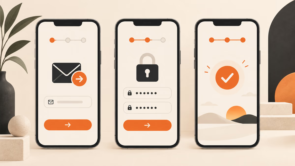
Design a poor onboarding handoff for a person who needs to finish one task quickly. State the audience and task you are assuming. Then show the user goal, entry point, essential action and success state in a low-fidelity flow. Use realistic labels and content lengths, with no invented metrics or testimonials. Describe the information hierarchy, mobile adaptation and next action. Explain one tradeoff and how you would check it with users.Vérification : Un nouvel utilisateur peut-il identifier l’action suivante sans lire une infobulle ?
Prompts pour concevoir l’écran principal
Pour concevoir l’écran principal, précisez l’utilisateur et la décision que l’écran doit aider à prendre.
11. Une réinitialisation de mot de passe confuse
Design a confusing password reset for a person who needs to finish one task quickly. State the audience and task you are assuming. Then use a clear hierarchy, realistic content lengths and one prominent primary action. Use realistic labels and content lengths, with no invented metrics or testimonials. Describe the information hierarchy, mobile adaptation and next action. Explain one tradeoff and how you would check it with users.Vérification : Vérifiez la mise en page sur ordinateur et sur un écran mobile de 360 pixels de large.
12. Un long formulaire de candidature
Design a long application form for a person who needs to finish one task quickly. State the audience and task you are assuming. Then use a clear hierarchy, realistic content lengths and one prominent primary action. Use realistic labels and content lengths, with no invented metrics or testimonials. Describe the information hierarchy, mobile adaptation and next action. Explain one tradeoff and how you would check it with users.Vérification : Vérifiez la mise en page sur ordinateur et sur un écran mobile de 360 pixels de large.
13. Un parcours de résiliation caché
Design a hidden cancellation path for a person who needs to finish one task quickly. State the audience and task you are assuming. Then use a clear hierarchy, realistic content lengths and one prominent primary action. Use realistic labels and content lengths, with no invented metrics or testimonials. Describe the information hierarchy, mobile adaptation and next action. Explain one tradeoff and how you would check it with users.Vérification : Vérifiez la mise en page sur ordinateur et sur un écran mobile de 360 pixels de large.
14. Une recherche sans résultat
Design an empty search result for a person who needs to finish one task quickly. State the audience and task you are assuming. Then use a clear hierarchy, realistic content lengths and one prominent primary action. Use realistic labels and content lengths, with no invented metrics or testimonials. Describe the information hierarchy, mobile adaptation and next action. Explain one tradeoff and how you would check it with users.Vérification : Vérifiez la mise en page sur ordinateur et sur un écran mobile de 360 pixels de large.
15. Un panneau de filtres mobile
Design a mobile filter panel for a person who needs to finish one task quickly. State the audience and task you are assuming. Then use a clear hierarchy, realistic content lengths and one prominent primary action. Use realistic labels and content lengths, with no invented metrics or testimonials. Describe the information hierarchy, mobile adaptation and next action. Explain one tradeoff and how you would check it with users.Vérification : Vérifiez la mise en page sur ordinateur et sur un écran mobile de 360 pixels de large.
16. Un téléversement retardé
Design a delayed upload for a person who needs to finish one task quickly. State the audience and task you are assuming. Then use a clear hierarchy, realistic content lengths and one prominent primary action. Use realistic labels and content lengths, with no invented metrics or testimonials. Describe the information hierarchy, mobile adaptation and next action. Explain one tradeoff and how you would check it with users.Vérification : Vérifiez la mise en page sur ordinateur et sur un écran mobile de 360 pixels de large.
17. Une page de paramètres dense
Design a dense settings page for a person who needs to finish one task quickly. State the audience and task you are assuming. Then use a clear hierarchy, realistic content lengths and one prominent primary action. Use realistic labels and content lengths, with no invented metrics or testimonials. Describe the information hierarchy, mobile adaptation and next action. Explain one tradeoff and how you would check it with users.Vérification : Vérifiez la mise en page sur ordinateur et sur un écran mobile de 360 pixels de large.
18. Un sélecteur de date inaccessible
Design an inaccessible date picker for a person who needs to finish one task quickly. State the audience and task you are assuming. Then use a clear hierarchy, realistic content lengths and one prominent primary action. Use realistic labels and content lengths, with no invented metrics or testimonials. Describe the information hierarchy, mobile adaptation and next action. Explain one tradeoff and how you would check it with users.Vérification : Vérifiez la mise en page sur ordinateur et sur un écran mobile de 360 pixels de large.
19. Un écran de confirmation peu clair
Design a weak confirmation screen for a person who needs to finish one task quickly. State the audience and task you are assuming. Then use a clear hierarchy, realistic content lengths and one prominent primary action. Use realistic labels and content lengths, with no invented metrics or testimonials. Describe the information hierarchy, mobile adaptation and next action. Explain one tradeoff and how you would check it with users.Vérification : Vérifiez la mise en page sur ordinateur et sur un écran mobile de 360 pixels de large.
20. Une mauvaise transition après la prise en main
Design a poor onboarding handoff for a person who needs to finish one task quickly. State the audience and task you are assuming. Then use a clear hierarchy, realistic content lengths and one prominent primary action. Use realistic labels and content lengths, with no invented metrics or testimonials. Describe the information hierarchy, mobile adaptation and next action. Explain one tradeoff and how you would check it with users.Vérification : Vérifiez la mise en page sur ordinateur et sur un écran mobile de 360 pixels de large.
Prompts pour gérer les données manquantes
Pour gérer les données manquantes, précisez l’utilisateur et la décision que l’écran doit aider à prendre.
21. Une réinitialisation de mot de passe confuse
Design a confusing password reset for a person who needs to finish one task quickly. State the audience and task you are assuming. Then include empty, loading and error states with recovery actions. Use realistic labels and content lengths, with no invented metrics or testimonials. Describe the information hierarchy, mobile adaptation and next action. Explain one tradeoff and how you would check it with users.Vérification : Vérifiez que l’utilisateur peut reprendre son travail sans perdre les informations saisies.
22. Un long formulaire de candidature
Design a long application form for a person who needs to finish one task quickly. State the audience and task you are assuming. Then include empty, loading and error states with recovery actions. Use realistic labels and content lengths, with no invented metrics or testimonials. Describe the information hierarchy, mobile adaptation and next action. Explain one tradeoff and how you would check it with users.Vérification : Vérifiez que l’utilisateur peut reprendre son travail sans perdre les informations saisies.
23. Un parcours de résiliation caché
Design a hidden cancellation path for a person who needs to finish one task quickly. State the audience and task you are assuming. Then include empty, loading and error states with recovery actions. Use realistic labels and content lengths, with no invented metrics or testimonials. Describe the information hierarchy, mobile adaptation and next action. Explain one tradeoff and how you would check it with users.Vérification : Vérifiez que l’utilisateur peut reprendre son travail sans perdre les informations saisies.
24. Une recherche sans résultat
Design an empty search result for a person who needs to finish one task quickly. State the audience and task you are assuming. Then include empty, loading and error states with recovery actions. Use realistic labels and content lengths, with no invented metrics or testimonials. Describe the information hierarchy, mobile adaptation and next action. Explain one tradeoff and how you would check it with users.Vérification : Vérifiez que l’utilisateur peut reprendre son travail sans perdre les informations saisies.
25. Un panneau de filtres mobile
Design a mobile filter panel for a person who needs to finish one task quickly. State the audience and task you are assuming. Then include empty, loading and error states with recovery actions. Use realistic labels and content lengths, with no invented metrics or testimonials. Describe the information hierarchy, mobile adaptation and next action. Explain one tradeoff and how you would check it with users.Vérification : Vérifiez que l’utilisateur peut reprendre son travail sans perdre les informations saisies.
Que vérifier avant d’utiliser le résultat
Les écrans générés sont des points de départ. Testez-les avec du contenu réel, au clavier, sur petit écran et auprès des personnes qui les utiliseront. Une présentation soignée ne prouve pas que l’interface est facile à utiliser.
Si le résultat ne répond pas à la tâche, raccourcissez le prompt et précisez l’information ou la contrainte manquante. Conservez la version utilisée pour pouvoir reproduire le visuel final ou la modification du code.
Pour aller plus loin
Poursuivre avec un guide associé
Mise en pratique
Votre prochaine étape
Vous avez une question ou une correction?
Contacter Thrive