La version courte
- Un prompt d’interface est plus utile lorsqu’il décrit une tâche utilisateur, un état d’écran et des contraintes d’accessibilité. Ces exemples proposent des directions de mise en page, sans affirmer de gains de conversion mesurés.
- Les écrans générés sont des points de départ. Testez-les avec du contenu réel, au clavier, sur petit écran et auprès des personnes qui les utiliseront. Une présentation soignée ne prouve pas que l’interface est facile à utiliser.
Un prompt d’interface est plus utile lorsqu’il décrit une tâche utilisateur, un état d’écran et des contraintes d’accessibilité. Ces exemples proposent des directions de mise en page, sans affirmer de gains de conversion mesurés.
Les écrans générés sont des points de départ. Testez-les avec du contenu réel, au clavier, sur petit écran et auprès des personnes qui les utiliseront. Une présentation soignée ne prouve pas que l’interface est facile à utiliser.
Comment utiliser cette collection
Choisissez la tâche la plus proche de votre travail. Copiez le prompt, remplacez la scène ou le contexte générique par vos informations et conservez les contraintes utiles pour évaluer le résultat. Modifiez une variable à la fois afin d’identifier ce qui s’améliore.
Cette méthode reprend les recommandations du guide de Figma First Draft : fournir un contexte précis et vérifier la réponse, sans supposer qu’un premier résultat soigné est correct.
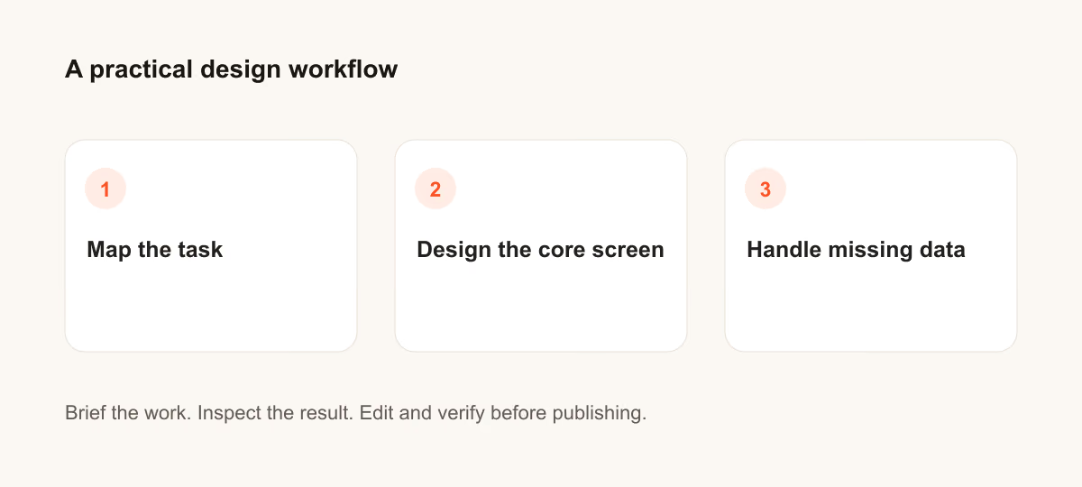
Prompts pour décrire la tâche
Pour décrire la tâche, précisez l’utilisateur et la décision que l’écran doit aider à prendre.
1. Un parcours d’inscription à une application pédagogique
Design a signup flow for a learning app for a person who needs to finish one task quickly. State the audience and task you are assuming. Then show the user goal, entry point, essential action and success state in a low-fidelity flow. Use realistic labels and content lengths, with no invented metrics or testimonials. Describe the information hierarchy, mobile adaptation and next action. Explain one tradeoff and how you would check it with users.Vérification : Un nouvel utilisateur peut-il identifier l’action suivante sans lire une infobulle ?
2. Un écran de résultats de recherche d’emploi
Design a search results screen for jobs for a person who needs to finish one task quickly. State the audience and task you are assuming. Then show the user goal, entry point, essential action and success state in a low-fidelity flow. Use realistic labels and content lengths, with no invented metrics or testimonials. Describe the information hierarchy, mobile adaptation and next action. Explain one tradeoff and how you would check it with users.Vérification : Un nouvel utilisateur peut-il identifier l’action suivante sans lire une infobulle ?
3. Un panneau de paramètres de notifications
Design a settings panel for notifications for a person who needs to finish one task quickly. State the audience and task you are assuming. Then show the user goal, entry point, essential action and success state in a low-fidelity flow. Use realistic labels and content lengths, with no invented metrics or testimonials. Describe the information hierarchy, mobile adaptation and next action. Explain one tradeoff and how you would check it with users.Vérification : Un nouvel utilisateur peut-il identifier l’action suivante sans lire une infobulle ?
4. Une page de vérification de commande
Design a checkout review page for a person who needs to finish one task quickly. State the audience and task you are assuming. Then show the user goal, entry point, essential action and success state in a low-fidelity flow. Use realistic labels and content lengths, with no invented metrics or testimonials. Describe the information hierarchy, mobile adaptation and next action. Explain one tradeoff and how you would check it with users.Vérification : Un nouvel utilisateur peut-il identifier l’action suivante sans lire une infobulle ?
5. Un état vide pour les éléments enregistrés
Design an empty state for saved items for a person who needs to finish one task quickly. State the audience and task you are assuming. Then show the user goal, entry point, essential action and success state in a low-fidelity flow. Use realistic labels and content lengths, with no invented metrics or testimonials. Describe the information hierarchy, mobile adaptation and next action. Explain one tradeoff and how you would check it with users.Vérification : Un nouvel utilisateur peut-il identifier l’action suivante sans lire une infobulle ?
6. Un tableau de bord d’éditeur
Design a dashboard for an editor for a person who needs to finish one task quickly. State the audience and task you are assuming. Then show the user goal, entry point, essential action and success state in a low-fidelity flow. Use realistic labels and content lengths, with no invented metrics or testimonials. Describe the information hierarchy, mobile adaptation and next action. Explain one tradeoff and how you would check it with users.Vérification : Un nouvel utilisateur peut-il identifier l’action suivante sans lire une infobulle ?
7. Un calendrier de réservation
Design a booking calendar for a person who needs to finish one task quickly. State the audience and task you are assuming. Then show the user goal, entry point, essential action and success state in a low-fidelity flow. Use realistic labels and content lengths, with no invented metrics or testimonials. Describe the information hierarchy, mobile adaptation and next action. Explain one tradeoff and how you would check it with users.Vérification : Un nouvel utilisateur peut-il identifier l’action suivante sans lire une infobulle ?
8. Un menu de navigation mobile
Design a mobile navigation menu for a person who needs to finish one task quickly. State the audience and task you are assuming. Then show the user goal, entry point, essential action and success state in a low-fidelity flow. Use realistic labels and content lengths, with no invented metrics or testimonials. Describe the information hierarchy, mobile adaptation and next action. Explain one tradeoff and how you would check it with users.Vérification : Un nouvel utilisateur peut-il identifier l’action suivante sans lire une infobulle ?
9. Un état d’erreur de paiement
Design an error state for payment for a person who needs to finish one task quickly. State the audience and task you are assuming. Then show the user goal, entry point, essential action and success state in a low-fidelity flow. Use realistic labels and content lengths, with no invented metrics or testimonials. Describe the information hierarchy, mobile adaptation and next action. Explain one tradeoff and how you would check it with users.Vérification : Un nouvel utilisateur peut-il identifier l’action suivante sans lire une infobulle ?
10. Un écran pour compléter le profil
Design a profile completion screen for a person who needs to finish one task quickly. State the audience and task you are assuming. Then show the user goal, entry point, essential action and success state in a low-fidelity flow. Use realistic labels and content lengths, with no invented metrics or testimonials. Describe the information hierarchy, mobile adaptation and next action. Explain one tradeoff and how you would check it with users.Vérification : Un nouvel utilisateur peut-il identifier l’action suivante sans lire une infobulle ?
Prompts pour concevoir l’écran principal
Pour concevoir l’écran principal, précisez l’utilisateur et la décision que l’écran doit aider à prendre.
11. Un parcours d’inscription à une application pédagogique
Design a signup flow for a learning app for a person who needs to finish one task quickly. State the audience and task you are assuming. Then use a clear hierarchy, realistic content lengths and one prominent primary action. Use realistic labels and content lengths, with no invented metrics or testimonials. Describe the information hierarchy, mobile adaptation and next action. Explain one tradeoff and how you would check it with users.Vérification : Vérifiez la mise en page sur ordinateur et sur un écran mobile de 360 pixels de large.
12. Un écran de résultats de recherche d’emploi
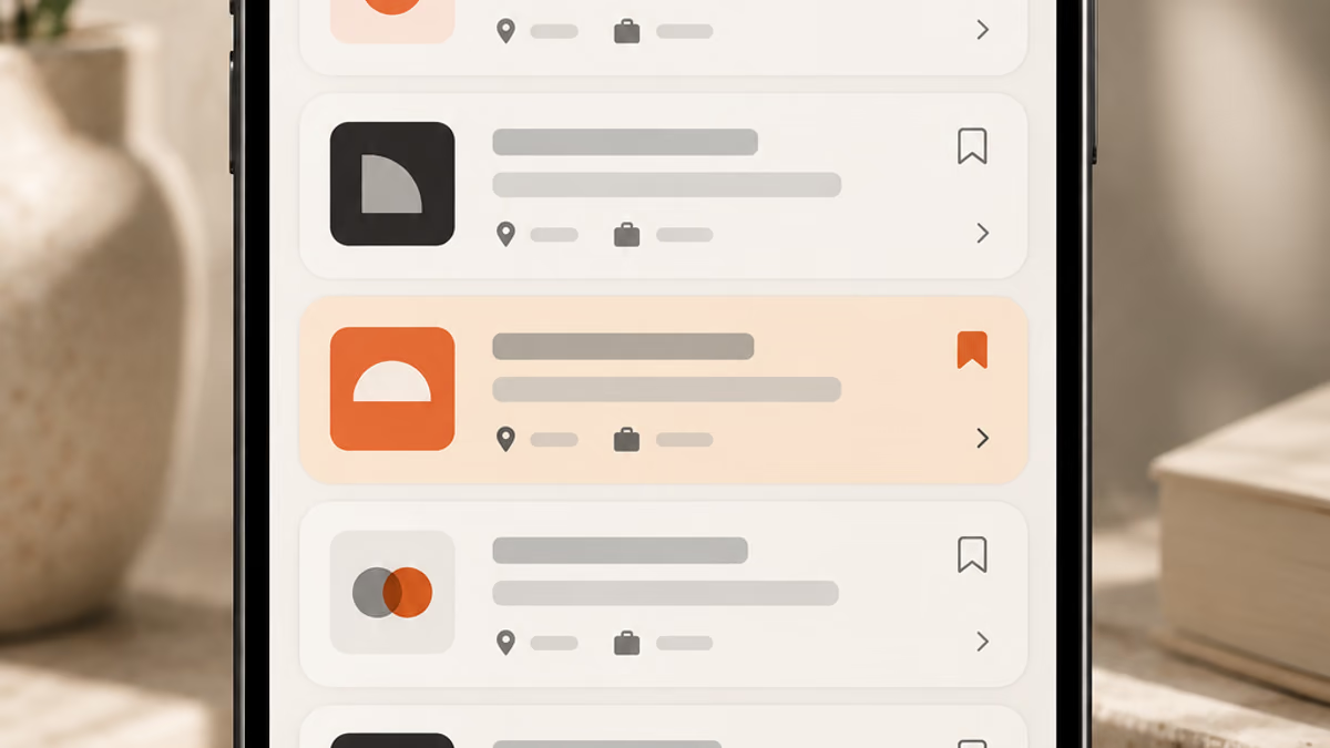
Design a search results screen for jobs for a person who needs to finish one task quickly. State the audience and task you are assuming. Then use a clear hierarchy, realistic content lengths and one prominent primary action. Use realistic labels and content lengths, with no invented metrics or testimonials. Describe the information hierarchy, mobile adaptation and next action. Explain one tradeoff and how you would check it with users.Vérification : Vérifiez la mise en page sur ordinateur et sur un écran mobile de 360 pixels de large.
13. Un panneau de paramètres de notifications
Design a settings panel for notifications for a person who needs to finish one task quickly. State the audience and task you are assuming. Then use a clear hierarchy, realistic content lengths and one prominent primary action. Use realistic labels and content lengths, with no invented metrics or testimonials. Describe the information hierarchy, mobile adaptation and next action. Explain one tradeoff and how you would check it with users.Vérification : Vérifiez la mise en page sur ordinateur et sur un écran mobile de 360 pixels de large.
14. Une page de vérification de commande
Design a checkout review page for a person who needs to finish one task quickly. State the audience and task you are assuming. Then use a clear hierarchy, realistic content lengths and one prominent primary action. Use realistic labels and content lengths, with no invented metrics or testimonials. Describe the information hierarchy, mobile adaptation and next action. Explain one tradeoff and how you would check it with users.Vérification : Vérifiez la mise en page sur ordinateur et sur un écran mobile de 360 pixels de large.
15. Un état vide pour les éléments enregistrés
Design an empty state for saved items for a person who needs to finish one task quickly. State the audience and task you are assuming. Then use a clear hierarchy, realistic content lengths and one prominent primary action. Use realistic labels and content lengths, with no invented metrics or testimonials. Describe the information hierarchy, mobile adaptation and next action. Explain one tradeoff and how you would check it with users.Vérification : Vérifiez la mise en page sur ordinateur et sur un écran mobile de 360 pixels de large.
16. Un tableau de bord d’éditeur
Design a dashboard for an editor for a person who needs to finish one task quickly. State the audience and task you are assuming. Then use a clear hierarchy, realistic content lengths and one prominent primary action. Use realistic labels and content lengths, with no invented metrics or testimonials. Describe the information hierarchy, mobile adaptation and next action. Explain one tradeoff and how you would check it with users.Vérification : Vérifiez la mise en page sur ordinateur et sur un écran mobile de 360 pixels de large.
17. Un calendrier de réservation
Design a booking calendar for a person who needs to finish one task quickly. State the audience and task you are assuming. Then use a clear hierarchy, realistic content lengths and one prominent primary action. Use realistic labels and content lengths, with no invented metrics or testimonials. Describe the information hierarchy, mobile adaptation and next action. Explain one tradeoff and how you would check it with users.Vérification : Vérifiez la mise en page sur ordinateur et sur un écran mobile de 360 pixels de large.
18. Un menu de navigation mobile
Design a mobile navigation menu for a person who needs to finish one task quickly. State the audience and task you are assuming. Then use a clear hierarchy, realistic content lengths and one prominent primary action. Use realistic labels and content lengths, with no invented metrics or testimonials. Describe the information hierarchy, mobile adaptation and next action. Explain one tradeoff and how you would check it with users.Vérification : Vérifiez la mise en page sur ordinateur et sur un écran mobile de 360 pixels de large.
19. Un état d’erreur de paiement
Design an error state for payment for a person who needs to finish one task quickly. State the audience and task you are assuming. Then use a clear hierarchy, realistic content lengths and one prominent primary action. Use realistic labels and content lengths, with no invented metrics or testimonials. Describe the information hierarchy, mobile adaptation and next action. Explain one tradeoff and how you would check it with users.Vérification : Vérifiez la mise en page sur ordinateur et sur un écran mobile de 360 pixels de large.
20. Un écran pour compléter le profil
Design a profile completion screen for a person who needs to finish one task quickly. State the audience and task you are assuming. Then use a clear hierarchy, realistic content lengths and one prominent primary action. Use realistic labels and content lengths, with no invented metrics or testimonials. Describe the information hierarchy, mobile adaptation and next action. Explain one tradeoff and how you would check it with users.Vérification : Vérifiez la mise en page sur ordinateur et sur un écran mobile de 360 pixels de large.
Prompts pour gérer les données manquantes
Pour gérer les données manquantes, précisez l’utilisateur et la décision que l’écran doit aider à prendre.
21. Un parcours d’inscription à une application pédagogique
Design a signup flow for a learning app for a person who needs to finish one task quickly. State the audience and task you are assuming. Then include empty, loading and error states with recovery actions. Use realistic labels and content lengths, with no invented metrics or testimonials. Describe the information hierarchy, mobile adaptation and next action. Explain one tradeoff and how you would check it with users.Vérification : Vérifiez que l’utilisateur peut reprendre son travail sans perdre les informations saisies.
22. Un écran de résultats de recherche d’emploi
Design a search results screen for jobs for a person who needs to finish one task quickly. State the audience and task you are assuming. Then include empty, loading and error states with recovery actions. Use realistic labels and content lengths, with no invented metrics or testimonials. Describe the information hierarchy, mobile adaptation and next action. Explain one tradeoff and how you would check it with users.Vérification : Vérifiez que l’utilisateur peut reprendre son travail sans perdre les informations saisies.
23. Un panneau de paramètres de notifications
Design a settings panel for notifications for a person who needs to finish one task quickly. State the audience and task you are assuming. Then include empty, loading and error states with recovery actions. Use realistic labels and content lengths, with no invented metrics or testimonials. Describe the information hierarchy, mobile adaptation and next action. Explain one tradeoff and how you would check it with users.Vérification : Vérifiez que l’utilisateur peut reprendre son travail sans perdre les informations saisies.
24. Une page de vérification de commande
Design a checkout review page for a person who needs to finish one task quickly. State the audience and task you are assuming. Then include empty, loading and error states with recovery actions. Use realistic labels and content lengths, with no invented metrics or testimonials. Describe the information hierarchy, mobile adaptation and next action. Explain one tradeoff and how you would check it with users.Vérification : Vérifiez que l’utilisateur peut reprendre son travail sans perdre les informations saisies.
25. Un état vide pour les éléments enregistrés
Design an empty state for saved items for a person who needs to finish one task quickly. State the audience and task you are assuming. Then include empty, loading and error states with recovery actions. Use realistic labels and content lengths, with no invented metrics or testimonials. Describe the information hierarchy, mobile adaptation and next action. Explain one tradeoff and how you would check it with users.Vérification : Vérifiez que l’utilisateur peut reprendre son travail sans perdre les informations saisies.
26. Un tableau de bord d’éditeur
Design a dashboard for an editor for a person who needs to finish one task quickly. State the audience and task you are assuming. Then include empty, loading and error states with recovery actions. Use realistic labels and content lengths, with no invented metrics or testimonials. Describe the information hierarchy, mobile adaptation and next action. Explain one tradeoff and how you would check it with users.Vérification : Vérifiez que l’utilisateur peut reprendre son travail sans perdre les informations saisies.
27. Un calendrier de réservation
Design a booking calendar for a person who needs to finish one task quickly. State the audience and task you are assuming. Then include empty, loading and error states with recovery actions. Use realistic labels and content lengths, with no invented metrics or testimonials. Describe the information hierarchy, mobile adaptation and next action. Explain one tradeoff and how you would check it with users.Vérification : Vérifiez que l’utilisateur peut reprendre son travail sans perdre les informations saisies.
28. Un menu de navigation mobile
Design a mobile navigation menu for a person who needs to finish one task quickly. State the audience and task you are assuming. Then include empty, loading and error states with recovery actions. Use realistic labels and content lengths, with no invented metrics or testimonials. Describe the information hierarchy, mobile adaptation and next action. Explain one tradeoff and how you would check it with users.Vérification : Vérifiez que l’utilisateur peut reprendre son travail sans perdre les informations saisies.
29. Un état d’erreur de paiement
Design an error state for payment for a person who needs to finish one task quickly. State the audience and task you are assuming. Then include empty, loading and error states with recovery actions. Use realistic labels and content lengths, with no invented metrics or testimonials. Describe the information hierarchy, mobile adaptation and next action. Explain one tradeoff and how you would check it with users.Vérification : Vérifiez que l’utilisateur peut reprendre son travail sans perdre les informations saisies.
30. Un écran pour compléter le profil
Design a profile completion screen for a person who needs to finish one task quickly. State the audience and task you are assuming. Then include empty, loading and error states with recovery actions. Use realistic labels and content lengths, with no invented metrics or testimonials. Describe the information hierarchy, mobile adaptation and next action. Explain one tradeoff and how you would check it with users.Vérification : Vérifiez que l’utilisateur peut reprendre son travail sans perdre les informations saisies.
Que vérifier avant d’utiliser le résultat
Les écrans générés sont des points de départ. Testez-les avec du contenu réel, au clavier, sur petit écran et auprès des personnes qui les utiliseront. Une présentation soignée ne prouve pas que l’interface est facile à utiliser.
Si le résultat ne répond pas à la tâche, raccourcissez le prompt et précisez l’information ou la contrainte manquante. Conservez la version utilisée pour pouvoir reproduire le visuel final ou la modification du code.
Pour aller plus loin
Vous avez une question ou une correction?
Contacter Thrive