To use Gemini 4 Argon for coding in the Gemini web app, select 4 Argon, turn on Canvas, and describe the app you want to build. Canvas gives you a code editor and a preview in the same workspace, so you can review the interface and request changes without setting up a local project first.
Our example is a React HR dashboard called Daylight People. The brief specifies a cream and yellow interface, compact navigation, a schedule, performance charts, and an employee table. It also specifies what should happen when someone changes a date range, searches employees, or exports a CSV. Those behaviors give you something to check beyond the appearance of the first screen.
What you need before starting
Use a desktop browser, sign in at gemini.google.com, and check that your model menu includes 4 Argon. Google's launch announcement lists Gemini app access for Google AI Pro and Ultra subscribers. Check your account's available models rather than assuming that signing in gives every account access. Google's Argon announcement
This tutorial uses the Gemini app. You do not need a Gemini API key, an npm project, or a terminal for the Canvas steps. API integration is a separate workflow; the API model identifier is gemini-4-argon. Google's model documentation
Have a design brief ready. A useful brief names the audience, the page sections, the visual hierarchy and the interactions. You can also attach a reference image you are allowed to use. Describe which features of the reference matter, such as its compact spacing or asymmetric chart layout, rather than asking for a vague "modern dashboard."
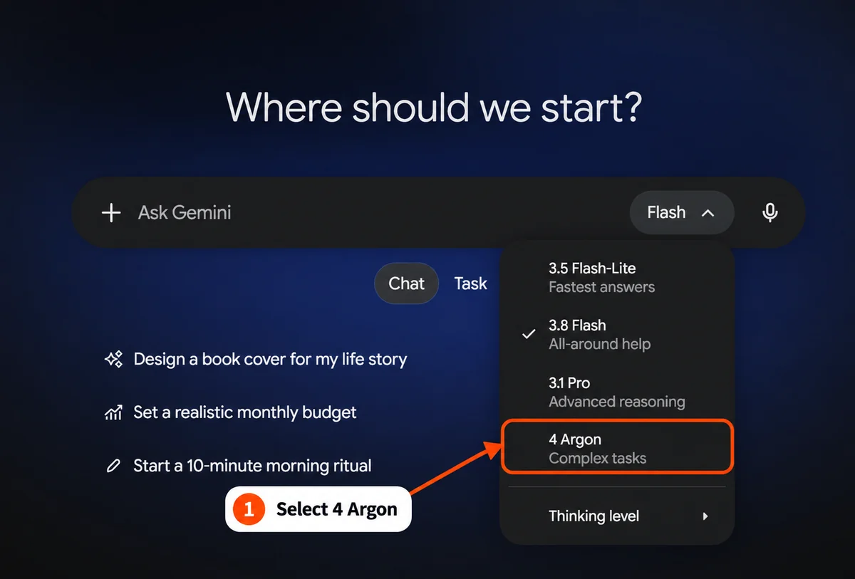
1. Select 4 Argon
Start a new chat and open the model picker beside the prompt field. In the interface checked for this guide, the menu listed 4 Argon with the description Complex tasks. Choose it, then confirm that the prompt bar says Argon.
The menu label is the practical check. A Gemini-branded homepage alone does not tell you which model will answer your next message.
2. Turn on Canvas before sending the prompt
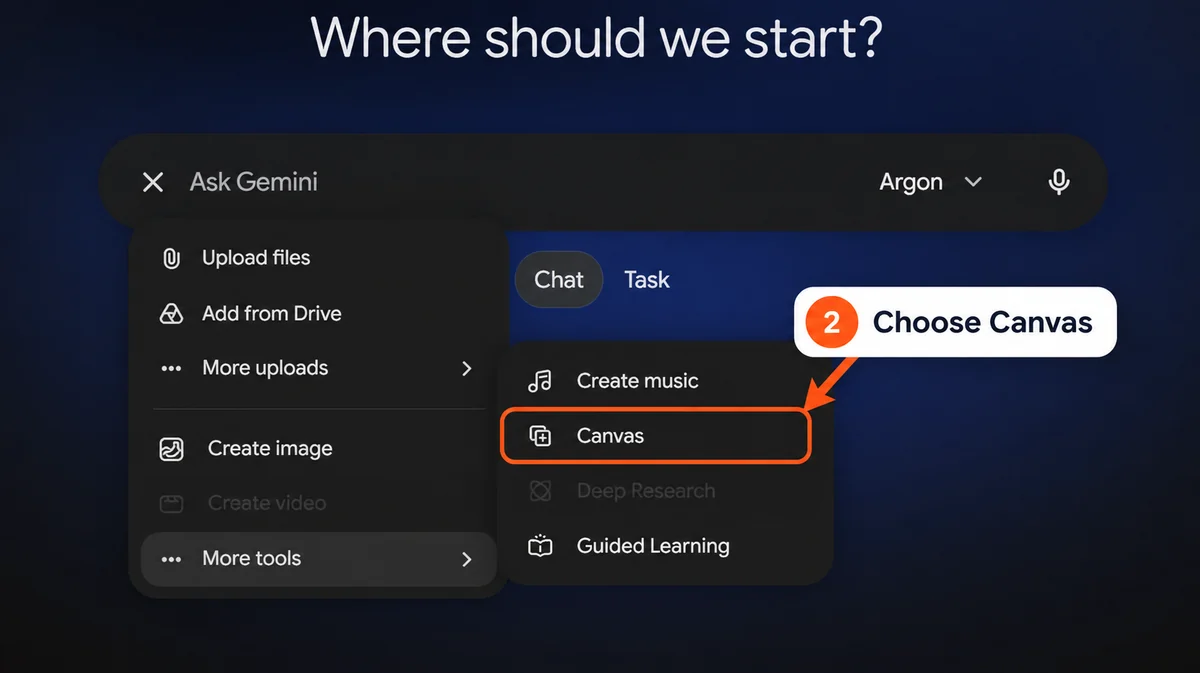
In the desktop interface we checked, the path was:
Click + beside the prompt field.
Open More tools.
Select Canvas.
Confirm that a Canvas chip appears in the composer.
Then enter the build prompt. Selecting the tool first gives Gemini the workspace where the React app should be created. Asking for code in an ordinary chat can produce a code block instead.
Control placement can change. Google's help page describes starting a chat with Canvas through the add-files menu; the screenshot and path above reflect the interface observed on 17 October 2026. Canvas help
3. Paste the dashboard prompt
The dashboard brief calls for an integrated header with compact statistics, an open-ring satisfaction gauge, and differently sized panels. The schedule occupies the left column. A performance chart and employment bars fill the next two columns, with a row of small leave tiles underneath. The employee table follows immediately below.
These instructions establish the composition before Gemini chooses individual components. They also explain the intended density: the initial desktop screen should contain useful data and the beginning of the table.
Try it yourself
With 4 Argon selected and Canvas enabled, copy the complete prompt below into Gemini and submit it. You can change the product name, colors and sample metrics to suit your own project. A plain-text copy is also available.
Create a polished, interactive React HR dashboard directly in the active Canvas, with a working Preview. Use React functional components and hooks. Use Tailwind CSS, lucide-react icons and Recharts if available in Canvas. Keep all data local and fictional. Do not call an API, connect a database, deploy anything, or return a standalone HTML page.

Product: Daylight People, a people operations workspace. The visual direction is a dense, carefully composed editorial dashboard: cream and pale butter yellow surfaces, charcoal text, a sunflower yellow accent, subtle gray borders, and compact typography. It should feel like a designed product, with varied panel sizes and useful information visible immediately. Avoid oversized KPI cards, giant headings, heavy shadows, purple gradients, and an evenly spaced wall of identical cards.

Desktop composition at approximately 1440 by 1000: make the application fill the entire preview viewport, edge to edge, with width: 100% and min-height: 100dvh. The application itself must have no outer frame, centered max-width container, gray surround, external padding, shell border or shell corner rounding. Make the left sidebar roughly 210px wide and full height, and let the main content fill the remaining width. Keep the cream-to-pale-yellow wash inside the application. Use 16-20px internal content gutters, 10-12px panel radii, 8-12px grid gaps, and a mostly 12-14px UI type scale with a 28-32px greeting. Use a clean system sans-serif stack with clear contrast. Distinguish the application's full-viewport layout from the smaller rounded panels inside it.

Scrolling architecture: constrain the app root to height: 100dvh with overflow: hidden. Use a roughly 210px sidebar and a flexible main region with min-width: 0 and min-height: 0. The main region must scroll vertically on its own with overflow-y: auto. The sidebar must not move when the main content scrolls. Make it a full-height flex column with the logo/header and bottom profile outside a separate flex: 1; min-height: 0; overflow-y: auto navigation area. Prevent html/body from becoming a shared dashboard scroller. On short screens, only the sidebar's navigation list should scroll, while its logo and bottom profile stay visible. On mobile, use a fixed overlay drawer with independent scrolling and lock the main scroll while it is open.

Sidebar: a small original Daylight People wordmark; a search field; a two-column grid of six navigation tiles with thin line icons (Dashboard, Employees, Time off, Finance, Payroll, Reviews). The selected tile should be charcoal with white text, the rest lightly outlined. Below that, show a compact favorites list, a short workspace menu, and a small profile control anchored at the bottom. Use initials avatars instead of remote photos.

Main area: breadcrumb and two small icon buttons at the top. Below it, a wide greeting band: Good morning, Alex; a date subtitle; four compact inline statistics (432 employees, 24 payrolls, 8% turnover, 24 applicants). At the right of this band, place a large, elegant open-ring gauge showing 80% employee satisfaction, with a sunflower yellow arc and small tick labels. Keep the metric strip integrated into the header rather than four separate cards.

Below the greeting, build an asymmetric three-column grid. Left: a schedule panel with Meetings / Tasks / Events tabs and two or three compact agenda cards; highlight the first meeting with a soft yellow gradient. Center: a team performance panel showing 70.32%, a restrained yellow line/area chart and a 7 days / 30 days / 90 days segmented control. Right: an employment status panel with three chunky rounded vertical bars for Permanent, Contract and Probation, using yellow, charcoal and gray. Below the center and right panels, put five narrow leave-balance tiles in one row: Annual, Monthly, Daily, Hourly, Sick. Use subtle borders to tie this row together.

Finish with a full-width employee table beneath these panels. Include eight fictional employees, initials avatars, employee ID, role, email at example.com, status, department and an actions button. Put search and a department filter in the table toolbar, plus Export CSV. On the desktop, the first few employee rows should be visible within the initial screen rather than below a huge empty chart.

Make the demo work: date ranges change the performance chart and its summary; schedule tabs show different content; search filters by name or email; the department filter combines with search; show a useful empty state with a reset button; Export CSV exports only visible employee rows; an employee action opens a small detail drawer that closes with Escape and returns focus. Navigation tiles should select and navigate to real in-page sections or show a clear compact placeholder, not silently do nothing. The satisfaction gauge must have a text equivalent.

Responsive behavior: at 390px use a working mobile navigation drawer, stack the panels, and keep page-level horizontal scrolling at zero. Let the table scroll inside its own container. Preserve readable text and touch targets. Include semantic headings, associated input labels, visible keyboard focus, aria-expanded on drawer buttons, a sensible focus order, and reduced-motion support.

Before coding, briefly state the layout decisions. Then build and render the complete React app in Canvas. After rendering, list only the checks you actually performed and identify anything that still needs manual testing. Do not claim production readiness or invent test results.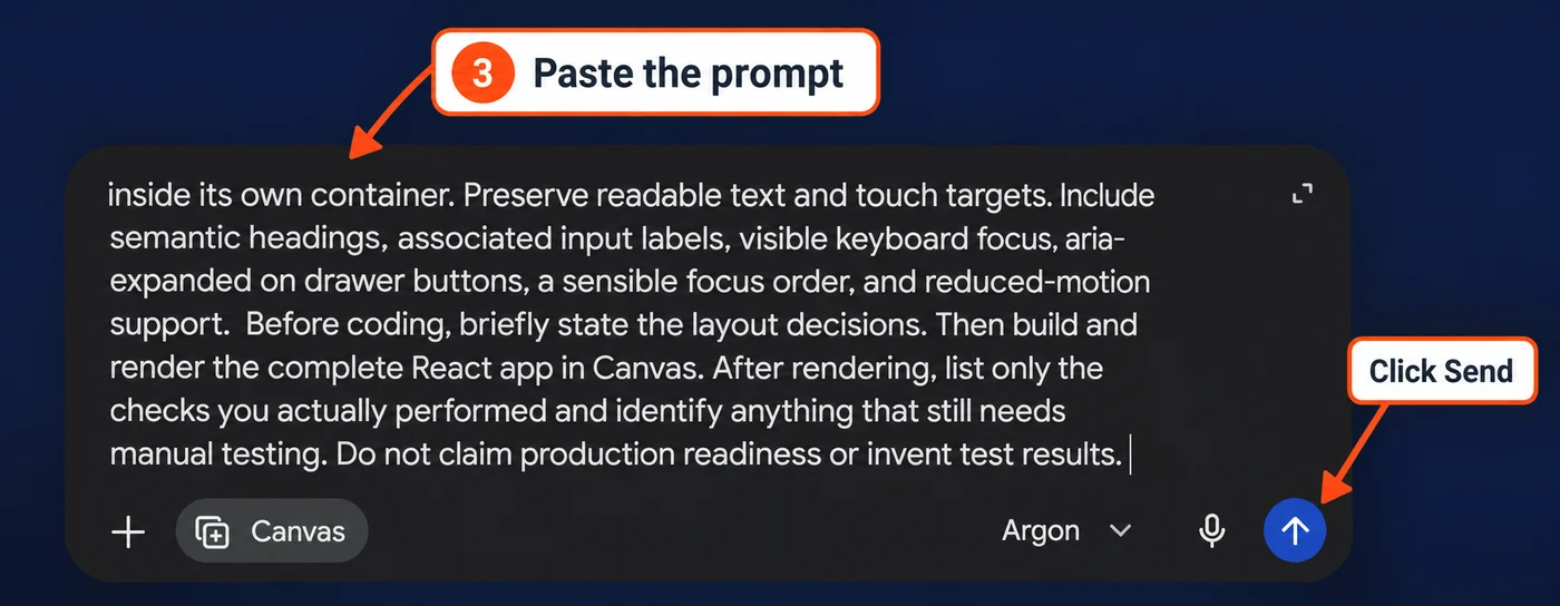
The prompt asks for React functional components and hooks. Tailwind CSS, lucide-react and Recharts are conditional on what Canvas supports in the session. It also asks for local fictional data, avoiding database setup while the layout and behavior are being evaluated.
Google documents React previews as a Canvas capability. The app's dependencies still need to load successfully in the preview; specifying a library is not evidence that its generated imports work. Google's Canvas introduction
4. Inspect the app in Preview
Wait for generation to finish, then inspect the Canvas preview. Use Code to review the implementation and Preview to return to the rendered interface. If the preview fails, check the console and report the error to Gemini before requesting more features. Google's Canvas help describes the code and console controls. Canvas code and error tools
Check the overall composition first. The greeting should not overwhelm the page. The four headline statistics should remain compact, and the schedule, chart and employment panels should have different widths. Look at whether the yellow accent establishes hierarchy without reducing text contrast.
After the desktop view, inspect a narrow viewport. An attractive desktop screenshot does not establish that the navigation opens on a phone or that a table stays inside its container.
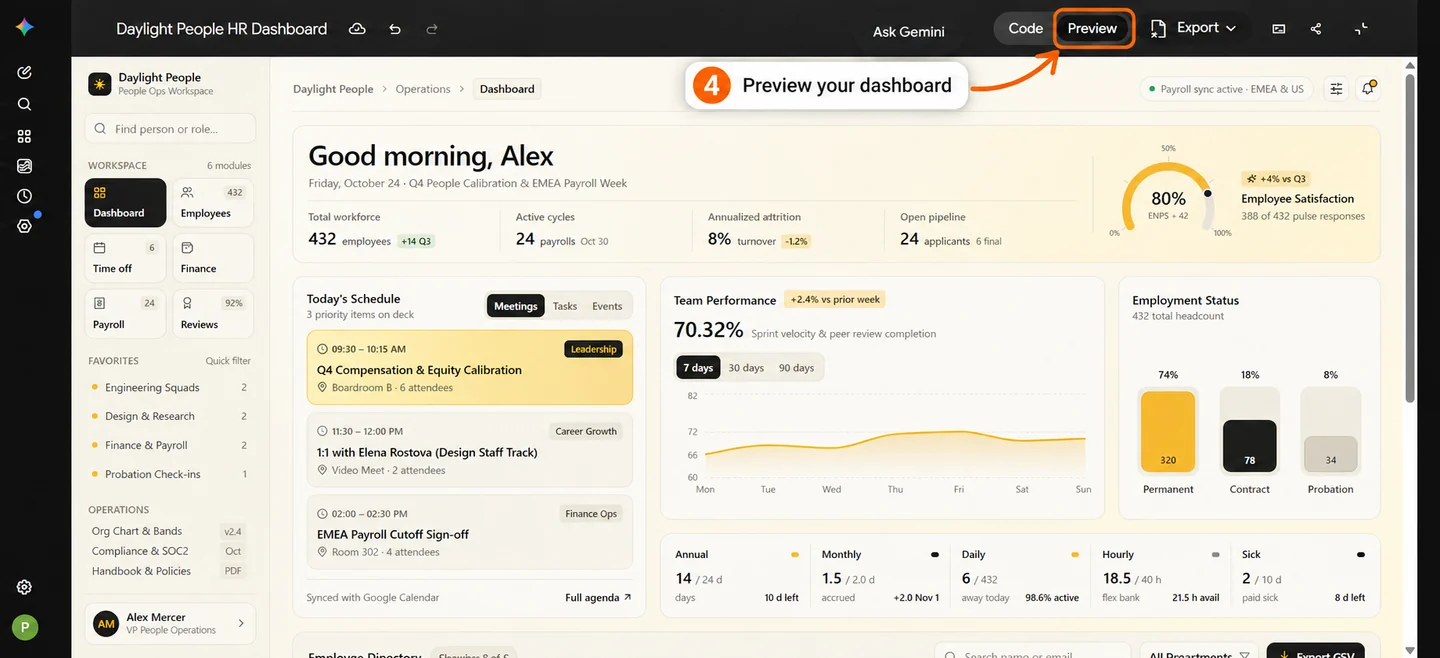
The example preview shows the cream and yellow dashboard, schedule, performance chart and employee directory. Your generated layout may differ.
5. Try the dashboard controls
Run a small set of repeatable checks. Write down the input and expected result before clicking, then record what happens.
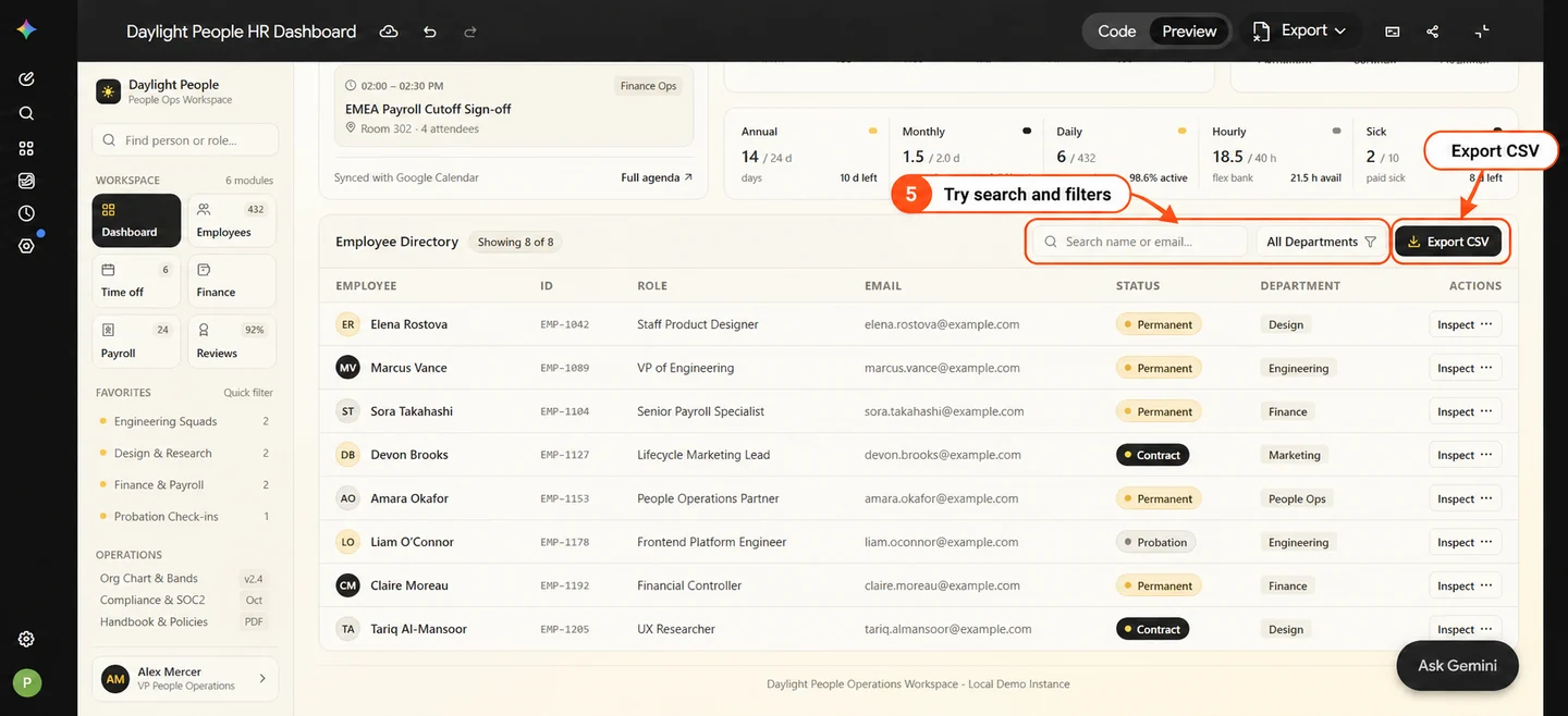
Control | What to try | What should happen |
|---|---|---|
Date range | Switch between 7, 30 and 90 days | The performance chart and its summary change consistently |
Schedule tabs | Open Meetings, Tasks and Events | Each tab shows its corresponding items and selected state |
Employee search | Enter a displayed employee name, then an email | Matching rows remain visible |
Department filter | Combine a department with search | Rows satisfy both conditions |
Empty state | Enter a name that is absent | An understandable empty state and reset control appear |
CSV export | Export after filtering | The CSV contains the visible rows with the expected headers |
Employee details | Open a row action, then press Escape | The drawer closes and keyboard focus returns to its trigger |
Mobile navigation | Open and close the drawer at 390px | Navigation remains usable without page-level horizontal scrolling |
Ask Gemini to separate its static code review from checks performed in a running browser. A generated checklist is useful, but its presence does not establish that any test passed.
6. Review the code before using it elsewhere
Once the prototype behaves as intended, review the code and dependency choices. Look for unexpected network calls, remote data sources and credentials. This example asks for fictional local data; connecting a real HR system would need a separate design for authentication, permissions and data handling.
Keep the Canvas private while you review it. Exporting code and creating a public share link are separate actions. Google explains that a public app link can expose the app and associated data to people with that link. Canvas sharing and export
The prototype is a starting point for implementation review. Before using it in a product, test it in that product's actual framework, dependency versions, device sizes and accessibility setup.
Troubleshooting the first build
You receive a code block instead of an app preview
Check whether Canvas was selected before you submitted the prompt. Confirm the Canvas chip and start the app there. For this walkthrough, the intended workflow is to build and review the React app inside Canvas.
The preview is blank or reports an import error
Open the console, copy the relevant error, and ask Gemini to repair that error while preserving the layout and working controls. If a dependency is unavailable, ask for a supported replacement. Verify the preview after the repair.
The result looks generic
Specify the panel proportions, spacing, type sizes and information density. A reference can show the intended visual direction, but explain what to carry into your own app. Keep your product name, content and assets original.
A button looks finished but does nothing
Describe the expected state change. For example, an employee details action should open a drawer; an export button should produce a file. Retest after the change, including the empty state and keyboard interaction where relevant.
Argon is absent from the model menu
Check the selected Google account and its model access. Canvas availability and access to a particular model are separate checks. Use Google's current access information rather than assuming the available model list matches the screenshot. Argon availability